Wednesday, May 3, 2017

Observations

So after class today, and having made a better pass at a model, that will most likely just be updated for Crit on Tuesday. I feel as though I am at a good spot. I have figured out that my project is more or less and intervention into my original Le Corbusier house, Villa Meyer. This is cutting out a good portion of the roof to make room for the intervention, which has become and observatory. My biggest challenge now is trying to tie my intervention together with the original house and how to make at least one or two floors work in my observatory, and with the following pictures you will see why.


As I talked about above of having to make this interact with the original house. I'm not sure how much I want it to focus on the original house. I like the idea of it being its own entity within the house. Yes, it has to interact with the house because, well that's where it's located, so I've tried to make those interacts very simple and elegant. 

But my main problem is finding a way to create a few platforms within the structure. It's difficult because of how splayed out the pieces are. Though I'm trying to work through this issue. 


Wednesday, April 26, 2017

Free Rein

For this final project, being able to do whatever we decide was at first kind of scary. 
However, I feel as though I have thought of a solid base that could lead me to something very interesting. Relating back to the exquisite corps obstruction, which was probably one of my favors, this project will do kind of the same thing but starting a different way. As well as probably ending very differently too. 

What I've decided to do is start with sticks, cut in the length of the walls of the Villa Meyer. At first I was planning on just using a single size for all of these sticks, but after talking with Professor Carranza, using different sizes would help with more definition of the project. I used thicker pieces of wood for the exterior load bearing walls, thinner pieces for the interior walls, and the thinnest pieces represents windows and some railings. 

So last night I experimented with placing (more so dropping) the sticks in different ways to see what would result. The following are some of those images. 


The main struggle I had with doing this, was as I continued through each different arrangement I discovered more ways to photograph each. So the first arrangement does not have the same photographs as the last one. 

Tuesday, April 11, 2017

Exquisite Corps Crit

For last project, my main critiques were that I needed to represent my platforms within my floor plan. And better represent where my stairs were as well. 

But overall, the hard work I put into representing this project I feel worked really well. 


Though the site I choose was ultimately challenging in figuring out exactly how the space would be in plan, I was able to grasp a good understanding of it, which allowed me to create the space I did. When I translated the caption of the Piranesi drawing and it said that the Rotunda would be used for theatrical presentations that was what ultimately sold me on using this location. Since I wanted to use my space as some type of performance area, it worked perfectly. 

If I could have added another collage to my presentation I would have looked into creating a view as if we were standing in the rotunda looking to where I had the entrance. That would have allowed the platforms to be represented even better and show the relationship they had to the overall space. 

Ultimately I am very happy about how this project came out, but of course there is usually always more one could do to better a project. 

Tuesday, March 21, 2017

Exquisite Corps


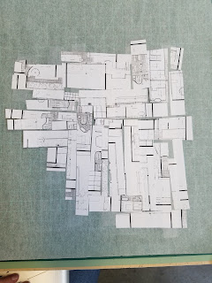
Above are my first three takes on the assignment of collages plans together. I'm a very literal/practical thinker, though I like to think that I'm very abstract, this studio is starting to prove me otherwise. But from my way of thinking I was trying to create practical spaces and spaces that would work for something. I was not thinking what the program of each space would be, but I was thinking about space, and potential rooms. So after crit, I went back to studio and started again, trying to be more abstract. Below are my next three takes at this assignment.

So to try and be more abstract and not think about spaces in my second attempt at these, I cut the floors plans into strips shuffled them up and then just spread them out and that was that for the first one. For the second, I just randomly cut the places into pieces and messed them together trying to connect at least one side from piece to piece. Then finally, the plans were cut into strips but of different widths and lengths, then put together however I picked up the pieces. I certainly think these three work better for the assignment but could still be more towards the "worse" of a solution. But let's see if I can make them into the "better" of a solution. 
Next step.... look at these plans in section. 


Friday, March 10, 2017

CRITical Comments

So after crit on Wednesday, I feel as though it went rather well. Though there are always the general "next step" comments as I call them. What one could do to push the project a little further. For me personally, what I was told was to break my boxes out of the footprint. So to stagger them more both in plan and section as it was like a "pancake". The other thought by the guest critic Samantha was to keep the idea I had of moving the stairs from interior to exterior and execute that more. So to make the connection of my different blocks with stairs that to are on the outside, and a lot of them!


Samantha also commented on my axon drawing, which I was very pleased to hear because that drawing took a lot of time! And I had to make sure I had ALL the lines this time. Also the wire drawing was rather difficult to take a picture of, but you can kind of get the image of it here. Looks much better in person.

Sunday, February 26, 2017

Flip Flop

For the second obstruction I've had more trouble grasping to idea of the project. I understand we are to take an attribute of the house and do the opposite of it, which I understand. But it was difficult for me to think through what exactly those things are, and what exactly the opposite is. So over the past few days I've been trying to really think of what parts of Villa Meyer are the most important and how to flip them. Here's what I've come up with.

1. Load bearing walls -> Pilotis
2. Ribbon/horizontal windows -> Punched out/vertical windows
3. Geometric -> Non-geometric/random
4. Interior Stairs -> Exterior stairs
5. Roof Garden -> Interior/Enclosed Garden (No roof access)

I'm not sure if this list may change between now and Tuesday, but I think for the most part it will stay the same. The only possible change in it that I see is number 3 that may be replaced with the void space that is produced in Villa Meyer that starts in the facade and moves to the interior double height space. This was discussed during our group desk crits on Friday, which I was behind with the models so I didn't get a full benefit from the crit so I have extra work to do before Tuesday. Therefore, 3 would then become the following: 
3. Void -> Solid 

Which could be very interesting and have an element of changing the geometry of the design anyways. Another way I also really plan to explore is how I can turn the plan of Villa Meyer into the section of this obstruction. Talking with Luis on Friday about that drew my interest in exploring that further. 

Wednesday, February 15, 2017

Drawings

So after today, I feel I have worked out a very good way to present my drawings for the final. I also promised updated plans so here those are.


I have also taken a floor off of my building, before I had two roof terrace floors to accommodate for a pool. However, I worked around that to combine them and simply have one roof terrace/garden. I also made the building a solid rectangle, rather than having the previous cutout in front of the stairs. I have to show the ribbon windows on the left walls, but I will fix that for my final presentation. Speaking of final presentation lets look at what I have laid out for that. 


Apologies for the yellow, but I used a color that could easily be written over, which Dr. Carranza took advantage of that during crit today. So for my presentation I'm pretty much going to be working from an axon in the middle sheet. moving elevations and presenting sections from those pieces. I plan on having the three sheets kind of step, as my building is so tall, making the drawings "grow" as they go. I'm going to experiment with ways to collage the main axon to indicate the 4 mains points of architecture that Le Corbusier incorporated in the Villa Meyer. 
I'm very excited to get started on these drawings!